I spent three weeks designing a whole new app - and a new Communications module for this app. Three iterations, several git commits, three versions of bubbles I was quietly proud of.
By the time I finished the third one, I was sitting in a user test watching someone navigate it. That’s when I realized I’d been trying to save the wrong idea.
I threw that version away. The redesign I’m testing now doesn’t look anything like it.
This post is the full process. What I thought I was solving, how I designed it (the stack, the skills, the long Claude Code sessions that actually shaped the decisions), why I picked the wrong frame, how user feedback exposed it, and what I am learning about design discipline when most of the craft now happens in a chat window.
The problem worth solving
Billabex is an app where users (mainly CEOs, CFOs, Finance teams and Sales Administrators working at SMBs in the service sector) supervise an AI agent doing cash collection. They check what the agent did, intervene when needed, and keep an eye on tricky accounts.
When I opened Amplitude to look at three months of product usage (Jan to Apr 2026), one pattern jumped out:
- Account Tasks: 44% of all feature interactions
- Communications: 32%
- Everything else combined: 24%
Tasks plus Communications equalled 76% of all feature interactions. Account selection, invoice selection, connection wizard, settings, all the rest combined was less than a quarter.
Another signal from the same data: about 40% of users go directly to a task after logging in. No browsing, no exploration. The app is task-driven, not something people wander through.
Meanwhile, customers were telling me the current Communications and Tasks modules did not talk to each other well. A finance lead at a mid-market SaaS put it like this:
“From the accounts receivable side, the follow-up with the client, you have to go to the account and modify it. It’s a little bit complicated.”
And:
“The client is sending the proof of payment and saying they are paid… we cannot jump in and resolve it.”
Translation: the information was scattered across Tasks, Communications, and Accounts, and they could not act on it where they were reading it. The Communications was the #2 most-used module, and it was friction-heavy.
So the target was clear: rebuild the Communications module around the account, make every conversation actionable in place, and prepare it for potential multi-channel (email today, SMS and formal notices tomorrow).
That is the problem. The interesting part is how I worked on it.
How I actually designed this
I am part of a bootstrapped team of three. Me on product and design, Quentin on engineering, Yassine on sales and growth. No full-time designer, no research team. The design craft is mine, but the product does not ship without cofounder pushback. What I have on the tooling side is ~110 transcripts synced to a local folder, an Amplitude account, Claude Code with a handful of skills installed, and a git repo. That is the stack.
Here is how it actually worked for this project.
Brainstorming before wireframing
I opened a Claude Code session and invoked the superpowers:brainstorming
skill. This skill forces you to explore intent and requirements before
touching implementation. The prompt is blunt: do not propose a UI, do not
propose a component, tell me what problem this module is for and who is supposed
to feel what when they open it.
That session is where the mental model came out. Not “Communications = inbox.” Not “Communications = thread list.” The model we converged on was:
Agent as collaborator, user as supervisor.
The AI agent owns the dunning process. It sends reminders, it follows up, it escalates. The user is there to supervise, intervene when the agent asks for help, and override when needed. This framing flipped everything downstream:
- Tasks are not a to-do list. They are the agent asking for help.
- Communications is not an inbox. It is the agent’s workbench, where you can see what it’s been doing and step in.
- Accounts is a command center, not a CRM rolodex.
None of that is visible in a bubble thread. But I did not see that yet.
HTML-first, no Figma
I prototype directly in HTML and CSS in a directory called explore/. No
Figma, no handoff, no design tokens exported to code. Each iteration is a git
commit with a dated diff. The repo itself is the design history.
Why: I need to feel the thing under my cursor, not stare at a flat frame. And every iteration has to be cheap enough to throw away, which rules out design tools where the finished artifact demands respect.
Three weeks of iterations show up in the git log as many commits, dated. I can walk V1 to V4 by checking out each SHA. That is also how the denial I talk about later is visible in public. You cannot hide from git.
Memory as the real unlock
Claude Code has a persistent memory system at the project level. After every session where I validate a decision, I save it to memory: the mental model, the module roles, the component reuse rules, the 7-day scoping on the default view, the sidebar order, the font change from Nunito to Outfit and why.
By the time I sat down to build V1 of the new Communications module, I was not starting from scratch. I was starting with a page of validated context that survived across sessions, days, even weeks of interruptions. The memory is what turns a sequence of 45-minute chats into something that feels like continuous design work.
What a long Claude Code session actually looks like
Not a one-shot prompt. Long back-and-forth where every decision gets pressure-tested.
Example: the scoping on the default view of the Communications workbench. How long a window should “Réponses reçues” and “Envois prévus” cover? Daily is too narrow, you miss weekend replies. Weekly does not match how finance teams actually work. We landed on rolling 7 days, giving 5 to 15 items for a ~60-account book, scannable at a glance. The rationale is now a memory entry so I do not re-litigate it next session.
Multiply that by every module decision and you have the shape of how the prototype was actually designed: brainstorming skill to set frame, long debates to pressure-test specifics, memory to lock validated choices, HTML to feel the result under your cursor, git to make iteration legible.
Here is the uncomfortable part. That stack is so good at helping me move fast that it quietly helped me move fast in the wrong direction.
V1: bubbles, because messaging apps have bubbles
My first assumption was implicit. I did not even notice I had made it. When I thought “messaging,” I thought bubbles. iMessage, WhatsApp, Slack threads. The mental shortcut was: people know how to read bubbles.
The brainstorming skill caught the big frame (agent as collaborator) but did not challenge the sub-frame (what a message container should look like once you decide to show one). That was on me. I imported the bubble default without interrogating it.
So V1 of the prototype had an account-centric Communications module with chronological chat bubbles. Agent messages, customer replies, a thread flowing down the page.
It looked clean. It demoed well. I was proud of it.
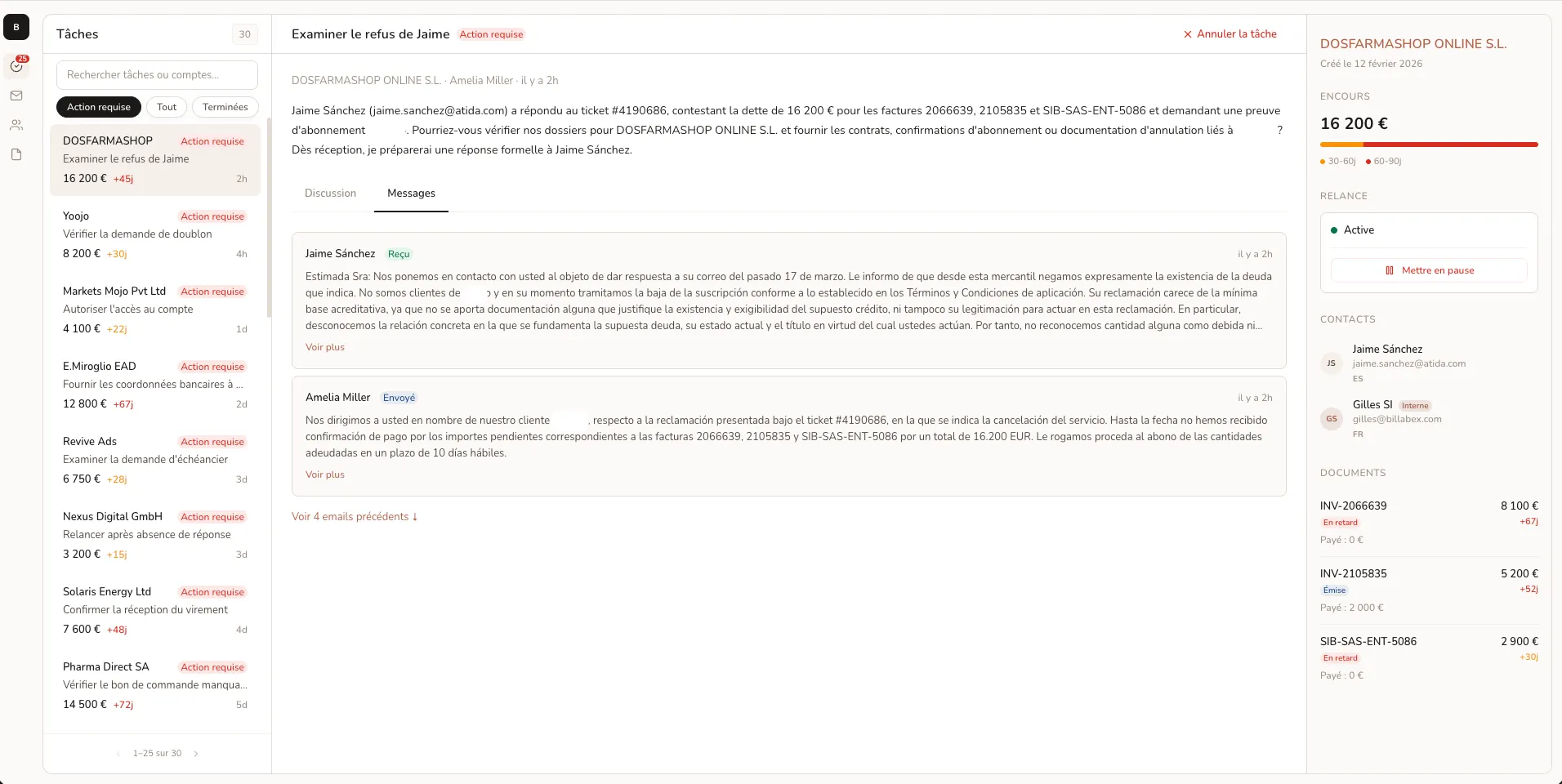
Here is the assumption buried inside: reading your communications equals reading a conversation. Like catching up on a group chat.
That assumption sounds innocent. It turned out to be the wrong frame for the actual job.
The test that killed it
Five days after the V1 prototype, I ran a user test with a support operations lead at a specialized SME distributor. I watched him navigate the new Communications module for twenty minutes. He liked a lot of it. Specifically, the fact that all communications for a given client were now visible at the account level, no more digging. That validated the account-centric direction.
Then, gently, he said something that took me a few minutes to fully absorb:
“Peut-être sur les communications, je pense que les gens sont plus habitués à avoir une version un peu comme par message. Juste une seule page, mais on peut scroll vers le haut ou vers le bas pour voir où on en est.”
Rough translation: “People are used to classic messaging. One page, scroll up or down to see where we are.”
At first I heard: “he wants a more familiar format.” I even had a defense ready. The bubble format is familiar, isn’t it iMessage?
But he kept coming back to the same point in different words. What he was really telling me was not about aesthetics. It was about the mental model.
He was not reading conversations. He was scanning agent activity. Scrolling a flat list to see what happened, what is coming up, what needs attention. The job was monitoring, not catching up on a thread.
Bubbles optimize for reading one message at a time. A flat chronological list optimizes for scanning many at once. I had designed for the wrong verb.
This is also the moment where the stack stopped helping me. Claude Code will pressure-test specifics inside your frame. It will not tell you your frame is wrong. That takes a human who uses your app for something you do not fully understand.
The two weeks of denial
This is the part I am least proud of.
Instead of listening to the test and revisiting the frame, I spent the next two weeks trying to save the bubble approach. V2 (April 1) was a layout iteration, tighter spacing, better timestamps, clearer sender labels. V3 (April 3) standardized bubble styling across modules for consistency.
Each of those iterations was a local optimization inside a broken frame. They made the bubbles look better. They did not change whether bubbles were the right container for the job.
The thing is, git makes this visible. Three commits of polishing a design my user had already told me was not going to work. You can literally read the message bodies of those commits and watch me not update my mind. The memory system, which normally helps me carry forward validated decisions, carried forward an invalidated one. Memory is a tool, not a referee.
I also had earlier customer feedback pushing toward “I need to see everything at once and act on it here,” but I had filed that as feedback on task management, not on comms. Tagging and indexing are acts of interpretation. I had put the feedback in the wrong folder in my head.
I knew. I just did not want to know.
V4: the accordion log
On April 6 I scrapped the bubble frame. Every place the app shows communications (the Communications module at account level AND the per-task Communications tab) now uses the same pattern: a master-detail accordion log.
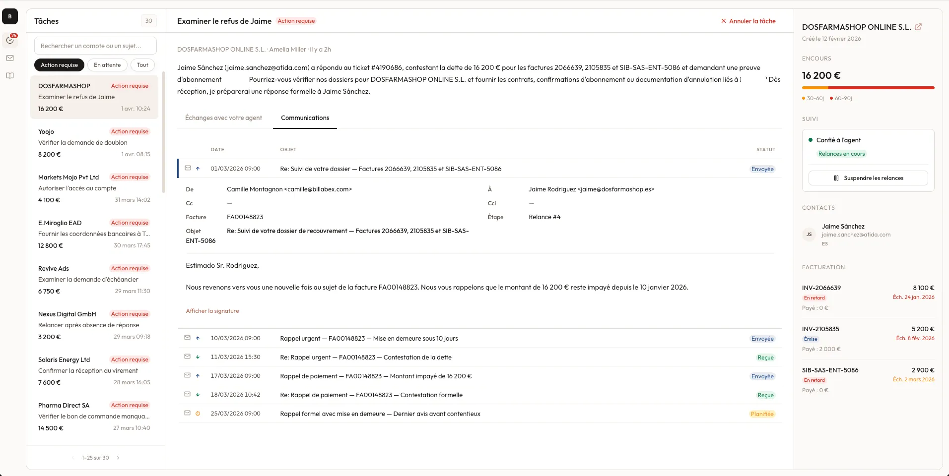
The pattern is the same wherever communications appear. A flat chronological table, one row per message (channel icon, direction, date, subject, status badge). Click any row, it expands inline to show the full email body. Quoted replies auto-collapse, signatures auto-collapse. The user can scan the whole history in seconds, or deep-dive into any one message in place.
At the module level, the master is the account list (left), and the detail is the full comms log for the selected account (right). At the task level (shown above), the master is the task list, and the detail is the task-scoped comms log inside the task view. Same verbs, different scope.
It looks boring next to bubble mockups. It is dramatically faster to use.
Multi-channel is now trivial. Email rows get an envelope icon, SMS rows get a message icon, future formal notices get a document icon. The table absorbs new channels without rethinking the layout.
The pattern matches the actual job: monitoring, scanning, intervening where needed. Not reading.
Worth noting: the pivot itself was fast once I accepted it. One Claude Code session, a fresh prototype file, the accordion pattern specced and built in an afternoon. The stack that let me build the wrong thing for three weeks also let me build the right thing in hours, once I knew what the right thing was.
The lesson I keep re-learning
Writing this out, the pattern is embarrassingly obvious in hindsight:
The shape of the UI should follow the shape of the job, not the shape of other apps in the same category.
“Messaging app” carried a stylistic default (bubbles) that I imported without interrogating it. My users are not customer-service reps on Intercom. They are finance operators checking up on their AI agent. Their verb is not “converse.” Their verb is “audit.”
Three takeaways I am holding onto:
- When user feedback makes you defensive, that is the feedback to listen to. My first instinct with the “classic messaging” comment was to argue. That was the tell.
- Iteration inside a broken frame is not iteration. It is procrastination. V2 and V3 felt like progress because commits were landing. They were not.
- The Claude Code stack makes me fast. It does not make me right. The brainstorming skill, the memory system, the HTML-first loop: all of that accelerates whatever direction I point it in. Correcting the direction is still my job, and the only reliable signal for that job is still a human using the thing in front of me.
The accordion log is not done. More user tests will probably challenge it in ways I have not predicted. But at least this time I am designing for the right verb.